57% of desktop visitors and 64% of mobile visitors never scroll past the first viewport (source data on first-viewport behavior). That changes the job of a homepage, landing page, or article page completely. Web design visual hierarchy isn't decoration, it's the system that decides whether a visitor spots the headline, understands the value, and sees the next step before attention disappears.
The practical definition is simple. Nielsen Norman Group frames visual hierarchy as the organization of design elements on a 2D display so users consume them in the intended order of importance, and that order is built with scale, color, contrast, grouping, and spacing (NNGroup's definition of visual hierarchy). When a page feels flat, users have to work too hard to find meaning. When hierarchy is clear, the page does some of that work for them.
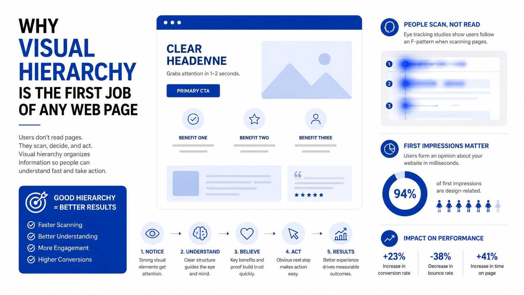
A useful way to think about it is this, hierarchy is a navigation system for attention. The eye looks for signals, then sorts them by importance. Bigger, bolder, and more isolated elements usually read first, while smaller and quieter elements recede. That's why a strong first screen can lift landing page conversion rates by 15–30% without changing the copy, because the design itself makes the right choice easier (conversion guidance and first-screen data).
Table of Contents
- Why Visual Hierarchy Is the First Job of Any Web Page
- The Primary Levers You Pull to Guide the Eye
- How Position, Spacing, and Grouping Create a Second Hierarchy Layer
- Matching Hierarchy Intensity to the Page Type
- Testing Whether Your Hierarchy Actually Works
- Keeping Hierarchy Intact on Mobile and Under Accessibility Constraints
- A Hierarchy Checklist and Frequently Asked Questions
Why Visual Hierarchy Is the First Job of Any Web Page
11 seconds on desktop, 7 seconds on mobile. That's the average above-the-fold attention window cited in the source data, and it explains why a page can't afford to introduce itself slowly (attention window and conversion data). Most visitors won't scroll, so the first viewport has to do the heavy lifting. If the headline, value proposition, and primary action don't appear in a clear order, the page has already lost the easiest conversion opportunity.
Hierarchy is not a style choice
A page with weak hierarchy forces users to scan every element at the same priority level. That creates cognitive load, because nothing tells the eye where to start or what matters most. NNGroup's framing is useful here, because it treats hierarchy as a way to organize information so people consume it in order of intended importance, not as a cosmetic layer added at the end (NNGroup on visual hierarchy).
Practical rule: if a visitor can't identify the main message in a quick glance, the layout is doing too many jobs at once.
The business case is straightforward. Strategic hierarchy can lift landing page conversion rates by 15–30% without changing copy, because the layout makes the existing message easier to see and act on (conversion guidance). You're not persuading harder, you're removing friction. That matters most on content-heavy pages, where equal-weight blocks blur together and the call to action gets lost in the noise.
What the eye needs first
Think in three layers. The first layer is the headline or main promise, the second is the supporting context, and the third is the primary action. The order can shift slightly by page type, but the rule stays the same, the most important element needs the clearest visual signal.
On a bad page, all three layers look similar. On a good page, the headline leads, the supporting copy sits back, and the action stands out without shouting at everything around it. That's the point of hierarchy, it gives the user a path instead of a puzzle.
The Primary Levers You Pull to Guide the Eye
Size and typography do most of the work
If you need a simple starting point, use a three-level type scale. Expert guidance recommends body text around 16px, subheads around 20px, and headings around 28px, so users can tell core message, context, and support apart at a glance (typographic scale guidance). The key is to make the differences meaningful, not tiny. If your heading is only one step larger than your subhead, the hierarchy looks polite but not decisive.
A page with complex content should almost never rely on one text size plus bold. That flattens the visual order. Instead, assign the largest size to the main message, a medium size to section labels or summary copy, and the body size to the detail that users can scan after they've oriented themselves.
Color, contrast, and weight need discipline
Color should support hierarchy, not replace it. A bright button and a muted surrounding field can work well, but only if the contrast stays readable. Accessibility guidance tied to hierarchy recommends WCAG AA contrast ratios of 4.5:1 for normal text and 3:1 for large text (contrast and readability guidance). That keeps emphasis from collapsing into low-legibility styling.
Rule of thumb: use color to separate actions or states, then use size and weight to state importance.
Typography choices also send structural signals. A bold heading against a regular body font reads as a break in the information stack, while italic or slightly heavier inline text should only mark emphasis within a sentence. If you're building in WordPress or any block editor, keep the number of font families small. Two families are usually enough to express structure without turning the page into a style sample.
For a practical starting recipe, keep the page easy to read in this order:
- Main heading: largest size, strongest weight, highest contrast.
- Support heading or subhead: medium size, calmer weight, clear separation.
- Body copy: regular weight, comfortable line length, no decorative treatment.
- Primary action: visually distinct, but not louder than the headline.
If you're working from a Bootstrap-oriented layout reference, this Bootstrap 5 resource is a useful companion for seeing how spacing and component structure affect type hierarchy in practice.
How Position, Spacing, and Grouping Create a Second Hierarchy Layer
Placement tells users where to look first
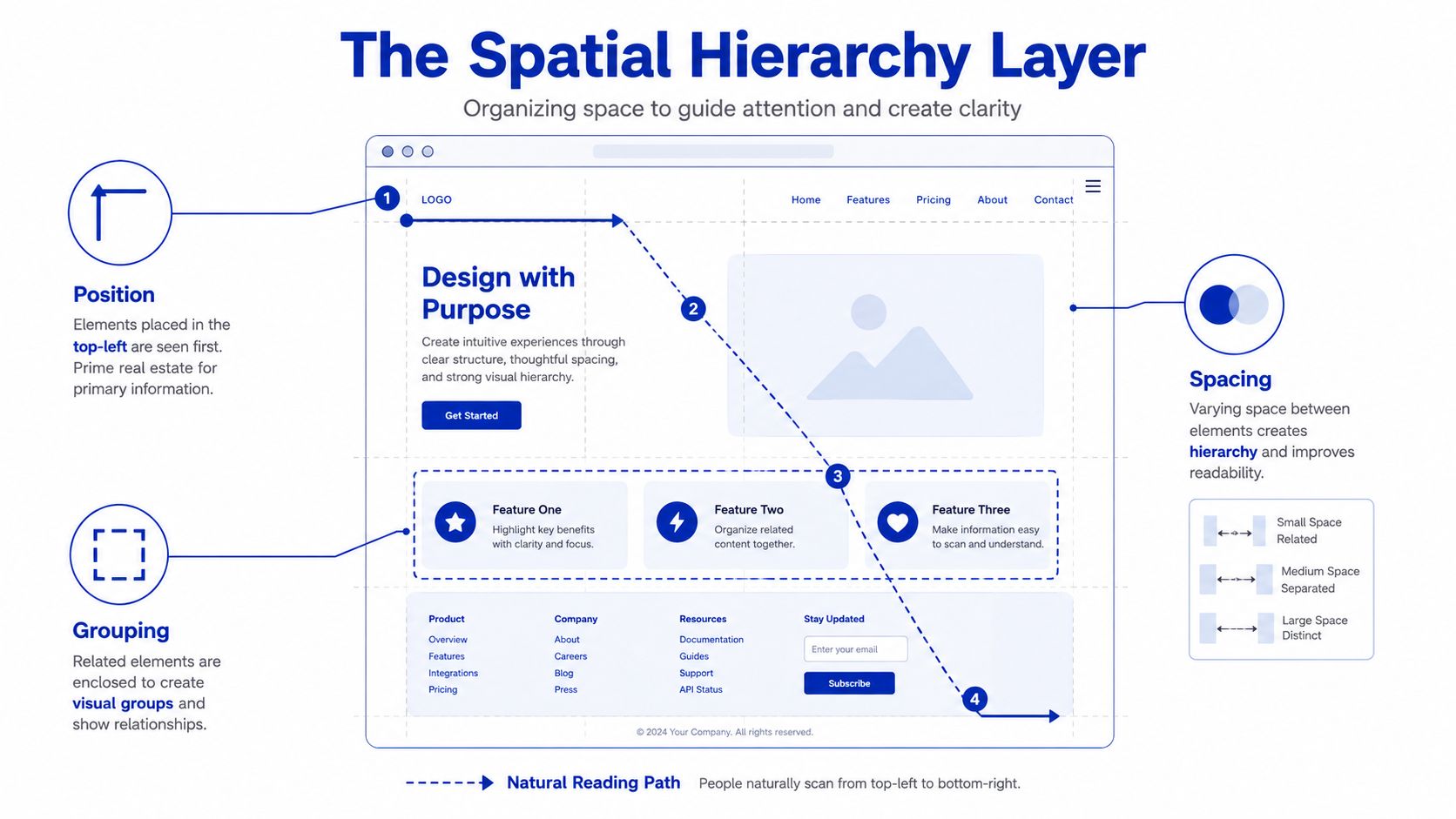
Position is a hierarchy signal all by itself. Design guidance notes that users tend to interpret items near the top-left and items placed along the natural reading path as more prominent (visual hierarchy and placement guidance). That makes the placement of your dominant action a decision, not a convenience. Put the most important thing where the eye is likely to land first, then let the rest of the page support that choice.
The same logic applies to scan behavior. If the page opens with a visual cluster that competes with the main message, the user has to sort the page before reading it. If the opening area is clean and the strongest element sits in the natural first view, the page feels easier immediately.
Spacing and grouping turn layout into meaning
Spacing is not empty space, it's a boundary signal. Tight proximity tells the user two things belong together. A larger gap tells them the thought has changed. That's why a heading, a short explanation, and a button often work best when they sit in one contained group with generous breathing room around them.
Alignment does similar work. When related items line up on the same grid, they feel like one system. When one piece breaks alignment without a clear reason, it reads as a new priority. That's useful when the design needs a single dominant action and a few secondary options that should stay quieter.
Keep one primary action per screen when possible, then give it enough white space that it doesn't compete with nearby links or cards.
A clean pattern for content-heavy pages is simple:
- Group related content tightly so sections feel intentional.
- Separate major sections with wider gaps so users can scan by block.
- Align supporting items consistently so they recede into the structure.
- Isolate the main action so it doesn't get swallowed by surrounding options.
For a block-theme example library, the HTML ecommerce template collection is a useful reference point for seeing how proximity, card grouping, and action placement change the feel of dense pages.
Matching Hierarchy Intensity to the Page Type
Landing pages need focus, not variety
A landing page has one job, push attention toward one action. That means the dominant element should be obvious, the support copy should be brief, and anything nonessential should recede fast. When too many focal points fight for attention, the user spends effort comparing rather than deciding.
Long-form pages need scan-friendly structure
Editorial pages and guides need a different rhythm. The user usually scans first, then reads. Headings, short summaries, and well-separated sections help them decide where to start and where to stop, which is why content pages benefit from visible signposts rather than a single oversized call to action.
Dashboards and product pages need relative emphasis
Dense interfaces are a different case again. Several items can matter at once, but not equally. The page should show relative importance through size, grouping, and contrast, while keeping a stable structure that lets users compare data without losing orientation.
| Page type | Dominant element | Secondary support | What should recede | Intensity |
|---|---|---|---|---|
| Landing page | Primary call to action | Value proposition, trust cues | Secondary links, extra detail | High |
| Long-form content page | Main heading and section path | Summaries, subheads, supporting examples | Navigation clutter, overly loud buttons | Moderate |
| Dashboard or product page | Key metric or main product decision | Filters, labels, related items | Decorative visuals, equal-weight cards | Moderate to high, depending on task |
The mistake many teams make is applying one hierarchy style everywhere. That makes editorial pages feel pushy and conversion pages feel vague. The better rule is to match intensity to the user's job, then let the page type decide how much contrast, white space, and type separation it needs.
Testing Whether Your Hierarchy Actually Works
Start with cheap visual checks
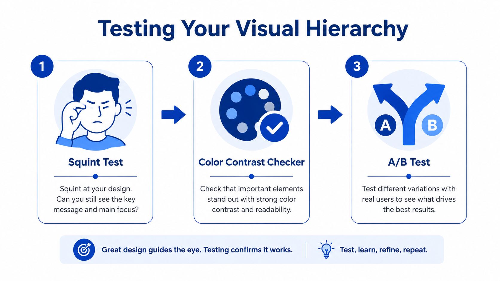
Before you use any formal test, strip away detail. The squint test tells you whether the page still has a clear dominant shape when details blur together. The blur test does something similar, because it reveals whether size and spacing survive when the eye loses fine texture. A grayscale check is useful too, because it shows whether the design depends too much on color instead of structure.
If the main button, headline, and supporting block all merge into one gray mass, the hierarchy isn't strong enough yet. If the intended focal point still pops, the structure is doing real work.
Move to evidence, not guesswork
Independent UX guidance recommends validating hierarchy with eye-tracking heatmaps, A/B tests, and user interviews, and it warns that what a designer thinks is the top element might be getting ignored (hierarchy validation guidance). That warning matters because content updates can change the visual weight of a page without anyone noticing. A new badge, image, or paragraph can steal attention from the main action.
For a practical naming framework when you audit layouts, the component identification guide is helpful. It gives teams a cleaner way to label what each piece of the interface is doing before they test whether the reading order makes sense.
Useful habit: if the page changed and conversions shifted, inspect hierarchy before you blame the copy.
Use the right test for the risk
Cheap tests catch obvious failures early. Heatmaps and interviews tell you where attention goes. A/B tests matter when the team needs to know whether one hierarchy choice performs better than another on a live page. Don't rely on a single test type, because each one answers a different question.
Keeping Hierarchy Intact on Mobile and Under Accessibility Constraints
Mobile needs fewer competing signals
A layout that feels clear on desktop can break on a phone because the screen gives you less room for parallel emphasis. The safest move is to reduce the number of distinct type sizes on narrow viewports, keep one dominant column, and let secondary content collapse below the first screen. That keeps the reading path linear enough to survive touch-driven scanning.
Tap targets also matter when they carry hierarchy weight. If the main action is visually strong but physically awkward to use, the interface creates a contradiction. The emphasis says “do this now,” while the tap area says “work harder.”
Accessibility should shape emphasis, not fight it
Hierarchy has to stay legible under low contrast, reduced vision, and color-blind conditions. That means you can't rely on color alone to show importance, and you can't let a strong visual style erode contrast. The same WCAG AA minimums that support readability on desktop still matter on smaller screens, because the page has less space to recover from weak contrast (contrast guidance).
Designers working on forms often run into the same issue, which is why accessible form design tips are useful as a reference for labels, spacing, and focus states that preserve hierarchy without making fields harder to use. The lesson carries over to every content block. Strong emphasis should remain readable, and supporting text should stay quieter without becoming faint.
The cleanest mobile pattern is progressive disclosure. Show the main idea first, then let the rest expand or stack below it. That keeps the first paint focused while still making secondary detail available for anyone who needs it.
For a lightweight WordPress workflow, the bootstrap-free templates ecommerce reference is a useful reminder that you can keep hierarchy clear without depending on heavy frameworks. Clean structure still wins when the content gets dense.
A Hierarchy Checklist and Frequently Asked Questions
Save this checklist for your next build
- Type scale: use clear size gaps, with the main heading, subheads, and body text each reading differently.
- Contrast: keep text readable under WCAG AA expectations, and test it on a light background and a dark one if your design uses both.
- White space: give the dominant element room to breathe, then use larger gaps to separate major sections.
- Dominant element: decide what should win the first glance, then make everything else support that choice.
- Reading path: check the first screen on desktop and mobile, then confirm the eye lands where you expected.
- Validation: run a squint test, then a grayscale check, then confirm with real user feedback or an A/B test for critical projects.
If the checklist fails on mobile, fix the structure before you touch the colors.
Frequently asked questions
How can I measure hierarchy without paid tools?
Use the squint test, grayscale check, and blur test first. Then ask three people what they noticed first, because a fast answer is often more honest than a long critique. If they all name the wrong element, the hierarchy needs another pass.
What do I do when a mobile breakpoint collapses the layout?
Reduce the number of competing focal points, move the dominant item to the top of the stack, and remove any decorative blocks that steal attention. Mobile hierarchy usually fails because too many elements keep desktop-sized importance.
How do I fix a page where the wrong thing is getting noticed first?
Strengthen the intended focal point with size, weight, or spacing, then quiet the surrounding elements. If the page still feels noisy, the issue is usually grouping, not just color. Rebuild the visual units so the main element has a cleaner frame.
Vekrumo publishes practical WordPress and lightweight site-building guidance that fits this topic well, especially if you're refining block patterns, typography, and page structure for real publishing work. If you want more hands-on tutorials and build-focused articles, visit Vekrumo and use it as a reference while you tighten the hierarchy on your next page.
Enhanced by the Outrank tool
Leave a Reply